Interactive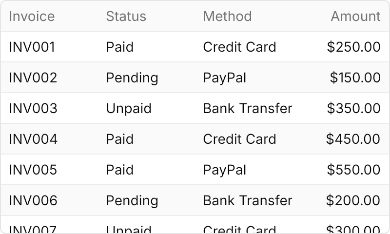
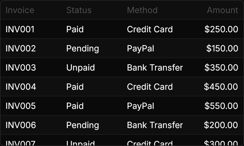
<TableView Theme="{StaticResource GpuiTable}" Classes="stripe"
           BorderThickness="1" CornerRadius="5.5"
           Width="400" Height="240" HorizontalAlignment="Left"
           ItemsSource="{x:Static local:Invoice.Samples}">
  <TableView.Columns>
    <TableViewColumn Header="Invoice" Binding="{Binding Id}" />
    <TableViewColumn Header="Status" Binding="{Binding Status}" />
    <TableViewColumn Header="Method" Binding="{Binding Method}" />
    <TableViewColumn Header="Amount" Binding="{Binding Amount}" HorizontalContentAlignment="Right" />
  </TableView.Columns>
</TableView>Usage
TableView Theme="{StaticResource GpuiTable}" gives GPUI Kit's plain table: a header band, rows sized by their content with a rule between them, 14px text at every size, cells centered in their rows, and no hover or selection colors. The default TableView theme is the Data Table; both share the cell and header themes. The table has no border of its own: BorderThickness="1" CornerRadius="5.5" is the bordered table of GPUI Kit's story.
Columns are TableViewColumns with a Header and a Binding. Width fixes a column in pixels, and HorizontalContentAlignment="Right" right-aligns a column's cells.
Examples
The default look: no border, no stripes, and the first and last columns fixed at 100px.
Interactive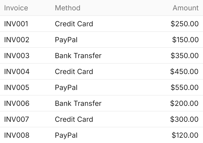
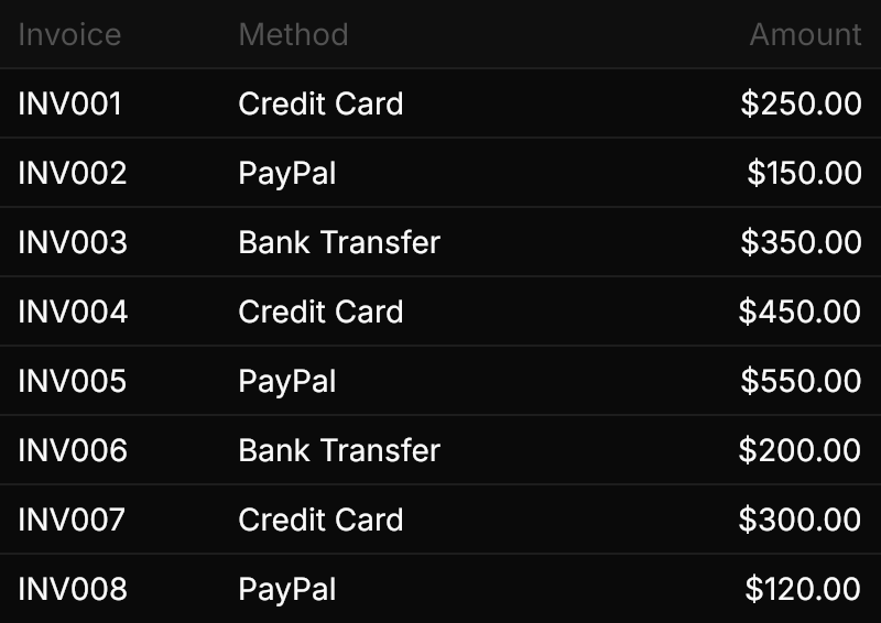
<TableView Theme="{StaticResource GpuiTable}" Width="400" HorizontalAlignment="Left"
           ItemsSource="{x:Static local:Invoice.Samples}">
  <TableView.Columns>
    <TableViewColumn Header="Invoice" Binding="{Binding Id}" Width="100" />
    <TableViewColumn Header="Method" Binding="{Binding Method}" />
    <TableViewColumn Header="Amount" Binding="{Binding Amount}" Width="100" HorizontalContentAlignment="Right" />
  </TableView.Columns>
</TableView>The size classes change only the padding of the cells.
Interactive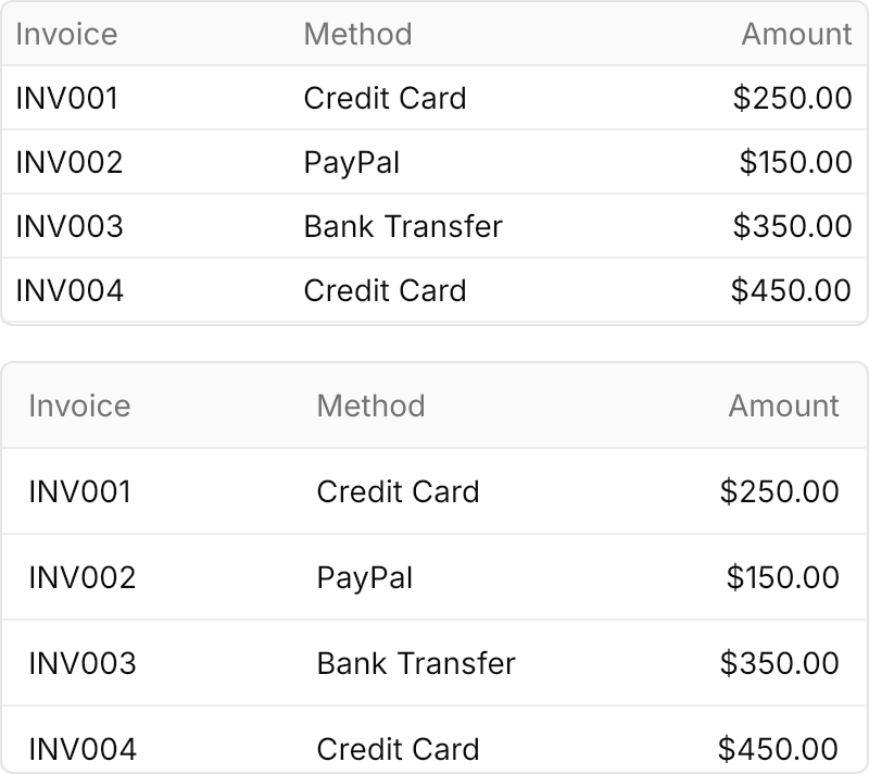
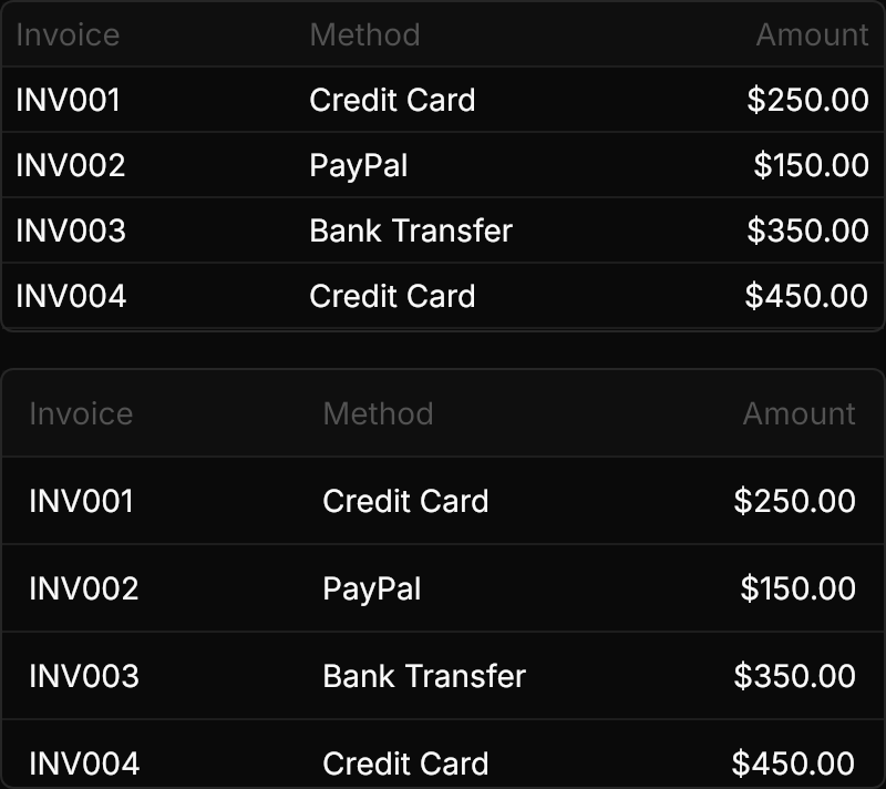
<StackPanel Spacing="16" HorizontalAlignment="Left">
  <TableView Theme="{StaticResource GpuiTable}" Classes="small" BorderThickness="1" CornerRadius="5.5"
             Width="400" Height="150" ItemsSource="{x:Static local:Invoice.Samples}">
    <TableView.Columns>
      <TableViewColumn Header="Invoice" Binding="{Binding Id}" />
      <TableViewColumn Header="Method" Binding="{Binding Method}" />
      <TableViewColumn Header="Amount" Binding="{Binding Amount}" HorizontalContentAlignment="Right" />
    </TableView.Columns>
  </TableView>
  <TableView Theme="{StaticResource GpuiTable}" Classes="large" BorderThickness="1" CornerRadius="5.5"
             Width="400" Height="190" ItemsSource="{x:Static local:Invoice.Samples}">
    <TableView.Columns>
      <TableViewColumn Header="Invoice" Binding="{Binding Id}" />
      <TableViewColumn Header="Method" Binding="{Binding Method}" />
      <TableViewColumn Header="Amount" Binding="{Binding Amount}" HorizontalContentAlignment="Right" />
    </TableView.Columns>
  </TableView>
</StackPanel>Not covered
TableFooterandTableCaption.