A chat bubble: text on a rounded surface in one of seven looks, aligned to a side, with a reaction.
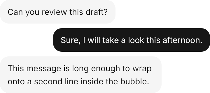
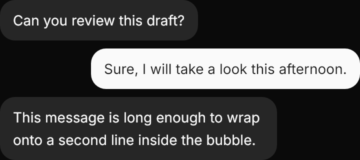
<StackPanel Width="360" Spacing="8" HorizontalAlignment="Left">
  <gpui:Bubble Classes="secondary start" Content="Can you review this draft?" />
  <gpui:Bubble Classes="end" Content="Sure, I will take a look this afternoon." />
  <gpui:Bubble Classes="secondary start" Content="This message is long enough to wrap onto a second line inside the bubble." />
</StackPanel>Usage
gpui:Bubble holds a message in 14px text with 12×8 padding on radius 15, at most 80% of the room it is given, stretched unless aligned with the class start or end. The look is a class: filled (primary) without one, secondary, muted, tinted (primary into the background), outline (a border on the background), ghost (no surface, the full width) or destructive. Reaction sets the content of a muted pill that hangs over the bottom edge at the end; reaction-top moves it to the top edge and reaction-start to the start. A Message adds the avatar, header and footer around bubbles.
Examples
The seven looks.
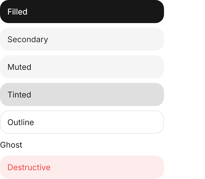
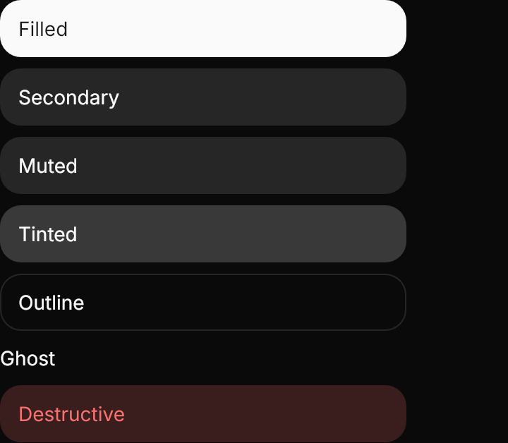
<StackPanel Width="360" Spacing="8" HorizontalAlignment="Left">
  <gpui:Bubble Content="Filled" />
  <gpui:Bubble Classes="secondary" Content="Secondary" />
  <gpui:Bubble Classes="muted" Content="Muted" />
  <gpui:Bubble Classes="tinted" Content="Tinted" />
  <gpui:Bubble Classes="outline" Content="Outline" />
  <gpui:Bubble Classes="ghost" Content="Ghost" />
  <gpui:Bubble Classes="destructive" Content="Destructive" />
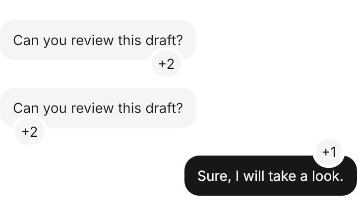
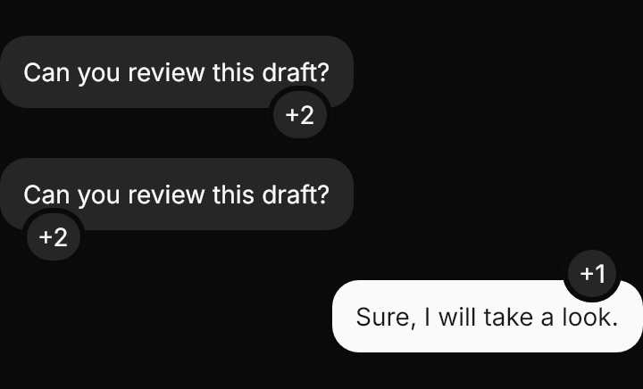
</StackPanel>A reaction at its default place, with reaction-start, and with reaction-top on an end bubble.
<StackPanel Width="360" Spacing="28" Margin="0,20" HorizontalAlignment="Left">
  <gpui:Bubble Classes="secondary start" Content="Can you review this draft?" Reaction="+2" />
  <gpui:Bubble Classes="secondary start reaction-start" Content="Can you review this draft?" Reaction="+2" />
  <gpui:Bubble Classes="end reaction-top" Content="Sure, I will take a look." Reaction="+1" />
</StackPanel>Not covered
- The automatic rounding of Buttons placed in the reactions row (give them
rounded-full).